Preview: HybridForms App with new UI themes
Our next major release is on the horizon: HybridForms version 10 will be released in early 2025 – and it will be a milestone. A new key App function is the selection of different themes, including dark mode for displaying the forms.
We are working intensively on the final optimizations and are in the home stretch of development and the final QA tests. And would like to share a few internal screenshots of the current status with you in advance (details may still change before the release).
New themes & dark mode for forms and checklists
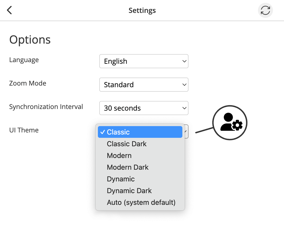
Settings: Select UI Theme
With version 10, the options in the App settings have been expanded and you can quickly and easily choose between individual predefined UI themes via the dropdown: Classic, Classic Dark, Modern, Modern Dark, Dynamic, Dynamic Dark. The individual themes can be used for each form, the functionality of the form remains unchanged, only the design changes. It is possible to switch between the themes at any time, for example to Dark Mode in difficult lighting conditions.
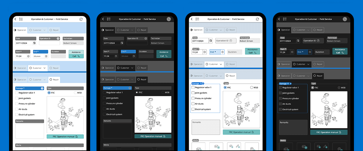
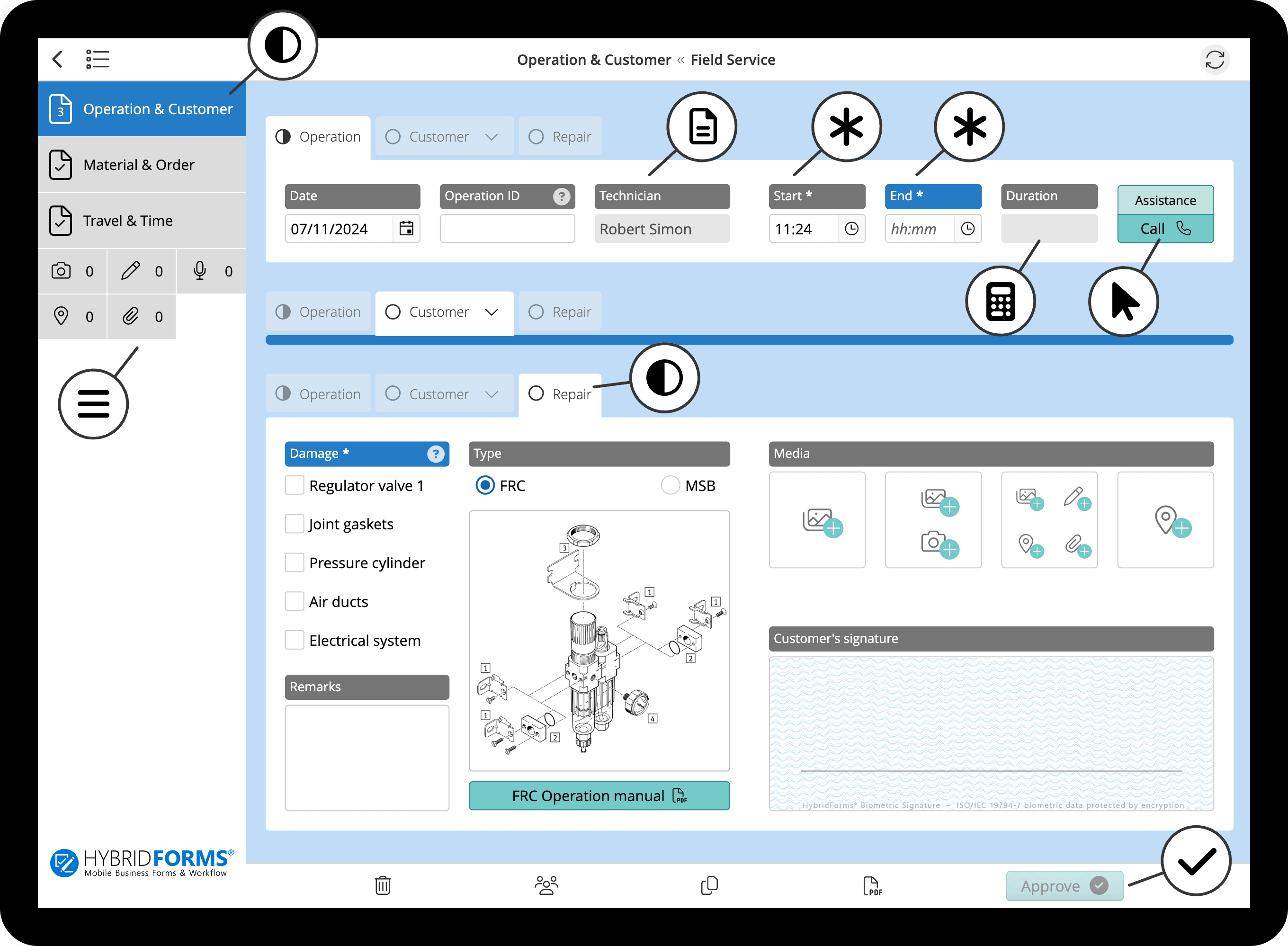
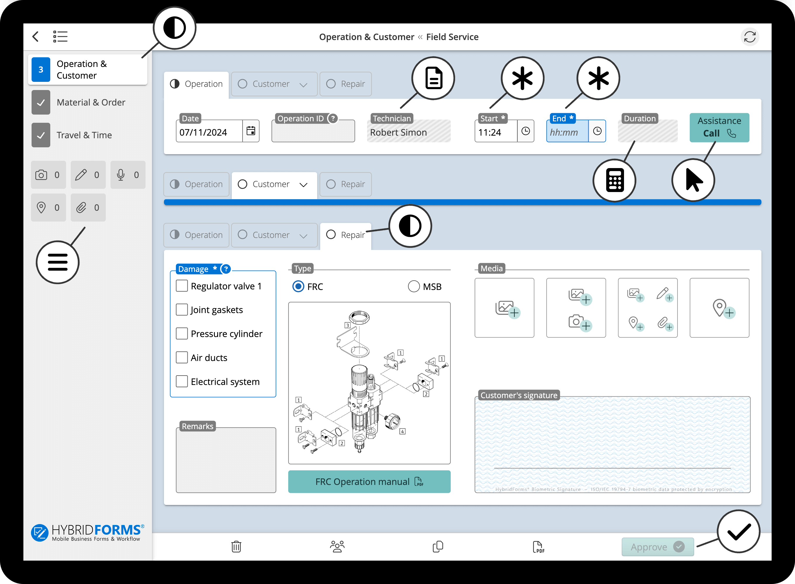
Classic Theme
The name says it all – this theme is our classic and has been used successfully for years. For version 10, some minor usability improvements have been integrated and design elements optimized.
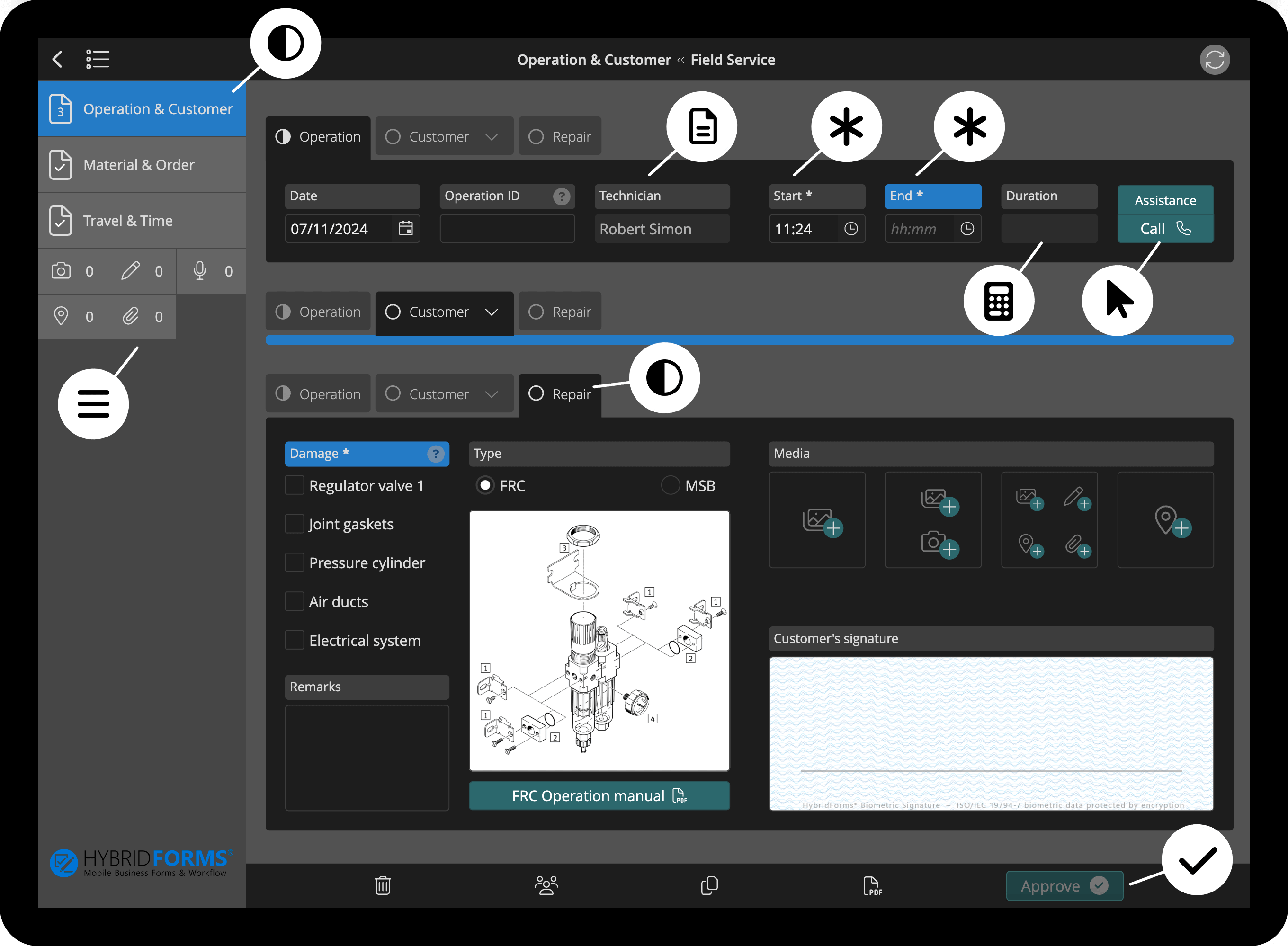
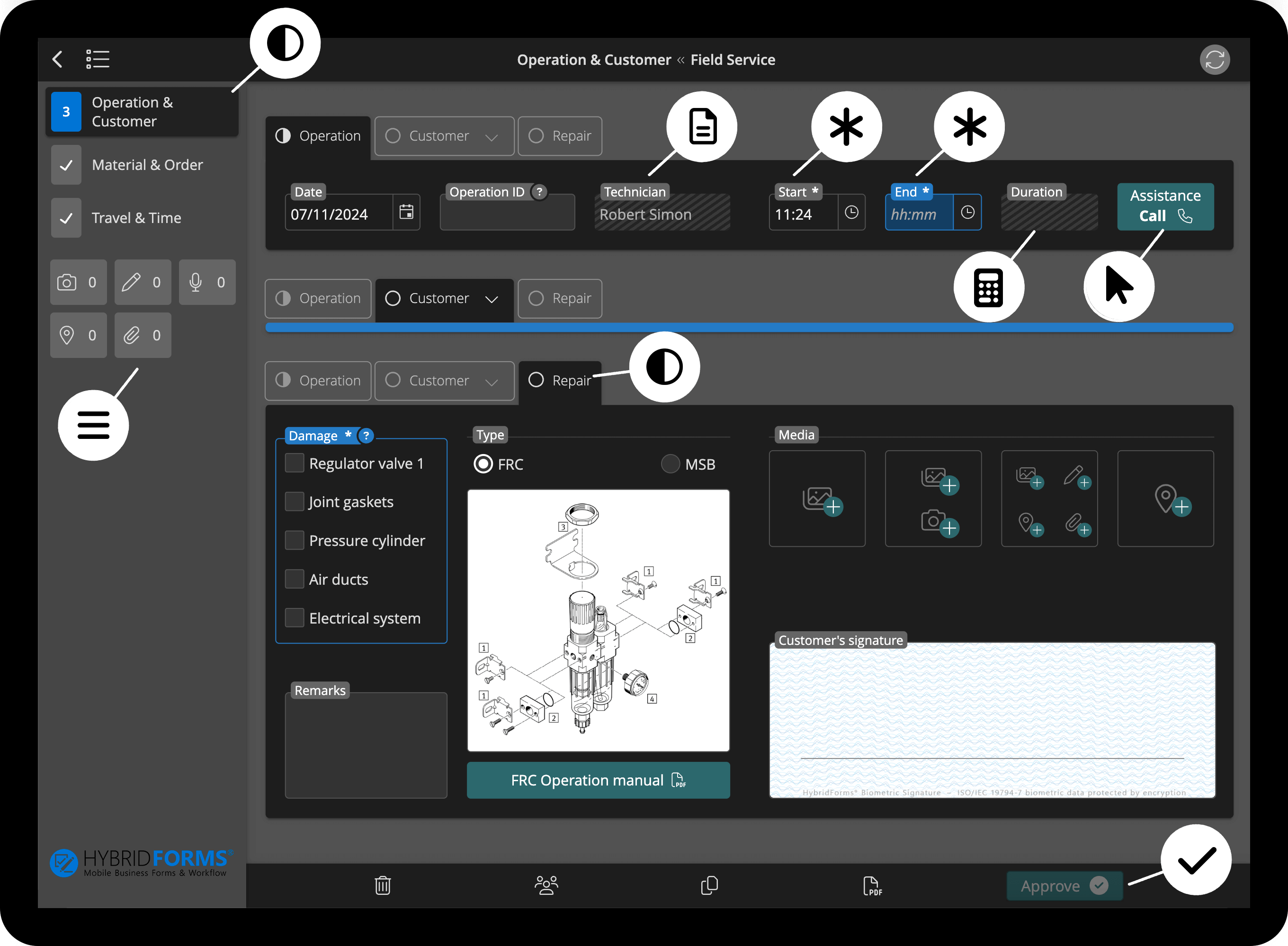
Classic Dark Theme
An optional dark mode was requested by many of our customers and had been on our roadmap for some time. In line with the basic concept of dark themes, light texts and symbols are displayed on a dark background and the color palettes are adjusted accordingly.
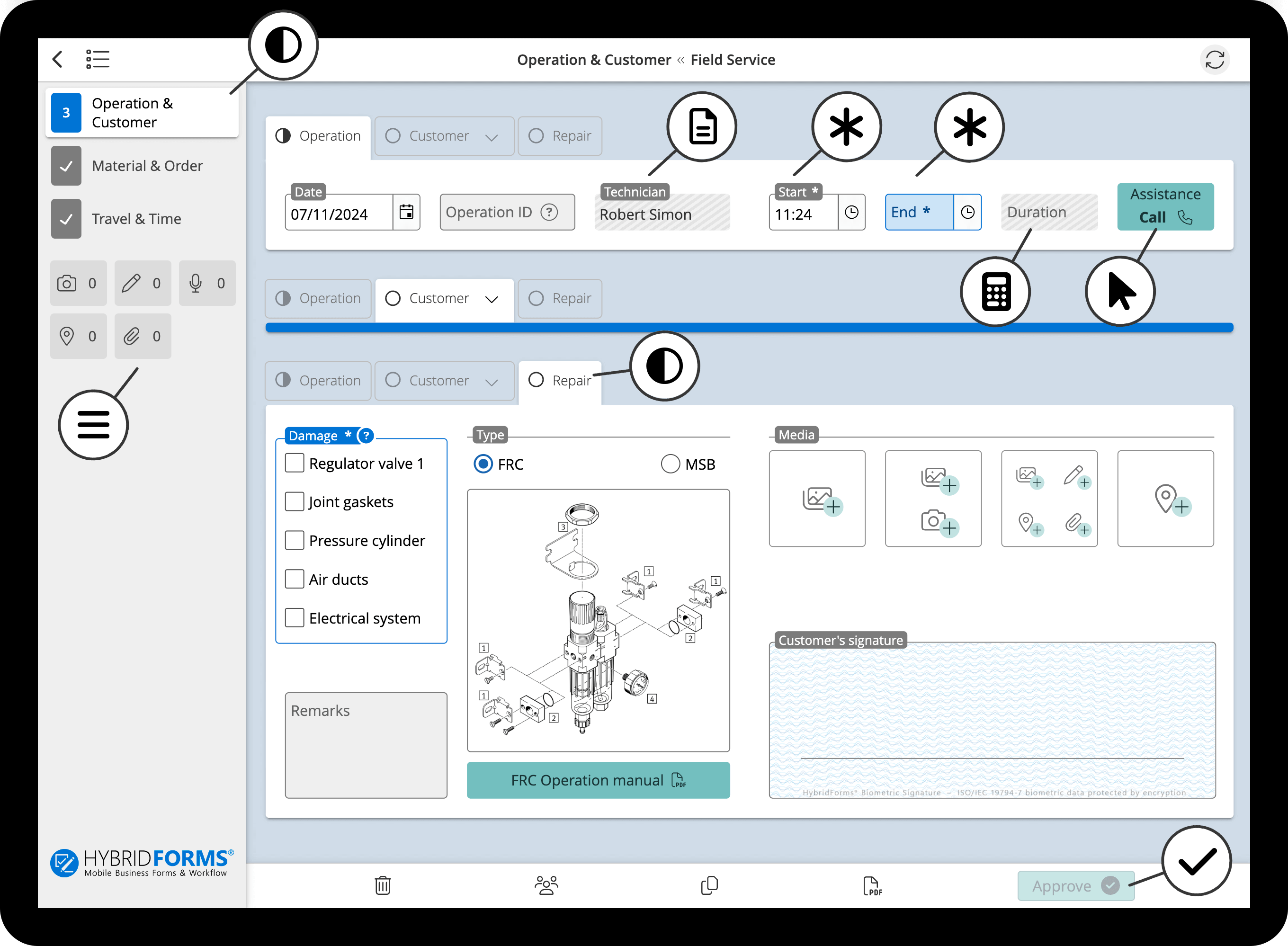
Modern Theme
Making a proven design even better – that was our aim when developing the new Modern UI theme. In addition to the clear visual design with reduced labels and desaturated colors, there are also usability optimizations such as the clearer labeling of automatically filled fields.
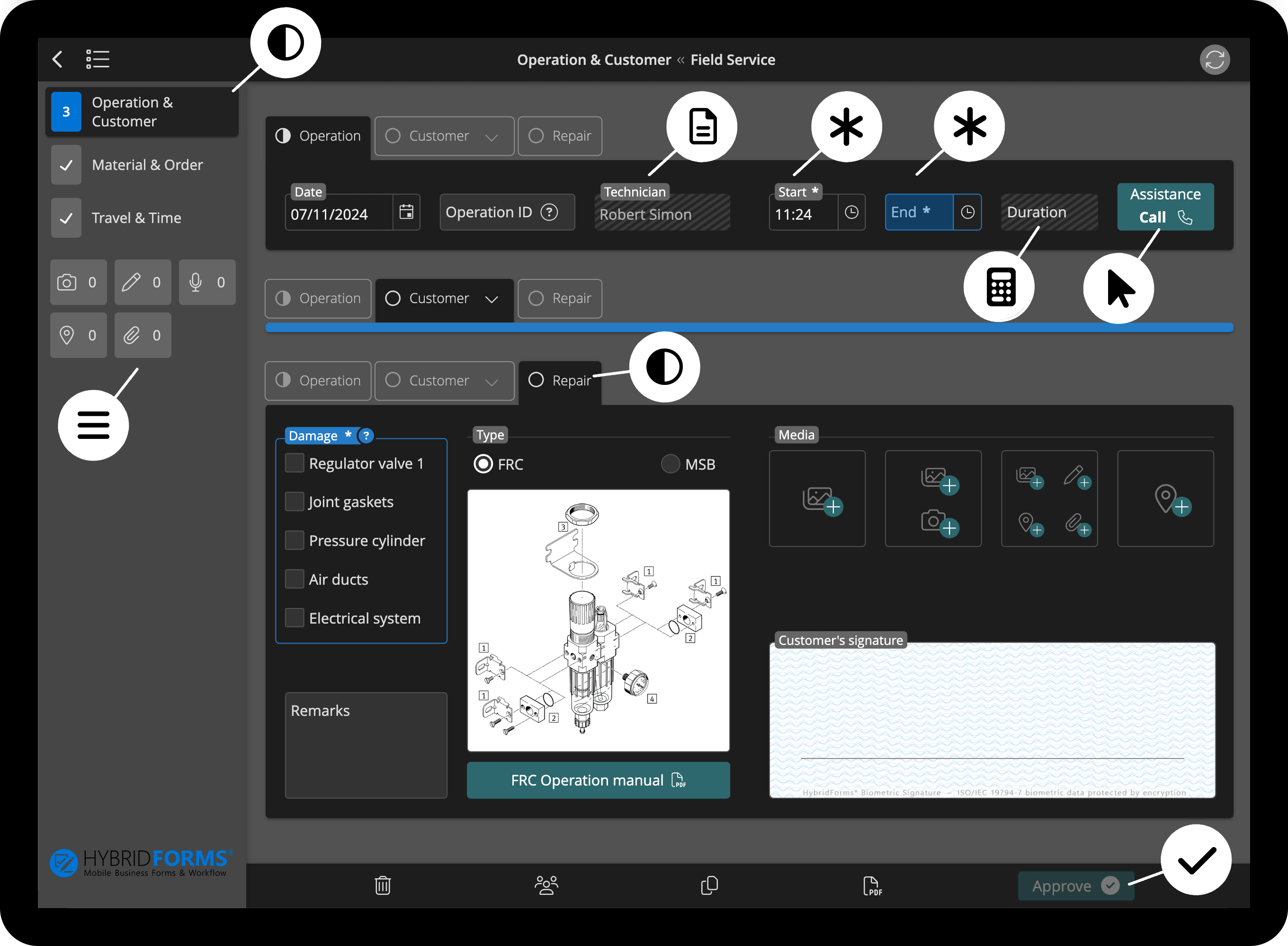
Modern Dark Theme
The Modern theme is of course also available in a dark version, adapted for working with dark App backgrounds.
Dynamic Theme
The Dynamic Theme is basically based on the Modern Theme, but differs in the display of empty input fields. The position of the label element for field titles is dynamic – depending on whether the field is empty or filled in. For empty fields, the label element is displayed in the input field and moves up as soon as the user starts typing. The advantage: Unfilled input fields are even easier to recognize at a glance.
Dynamic Dark Theme
The Dynamic Theme is also available in a dark design as the Dynamic Dark Theme.
Customized themes & branding
All standard HybridForms themes can now be customized even more systematically. Customizing an UI theme can range from the placement of the company logo to the adaptation of fonts and colors to the company’s branding.